


Branding - Teavana
This is a rebranding manual I designed for Teavana based on my love of tea and the belief that they could push their brand even further.
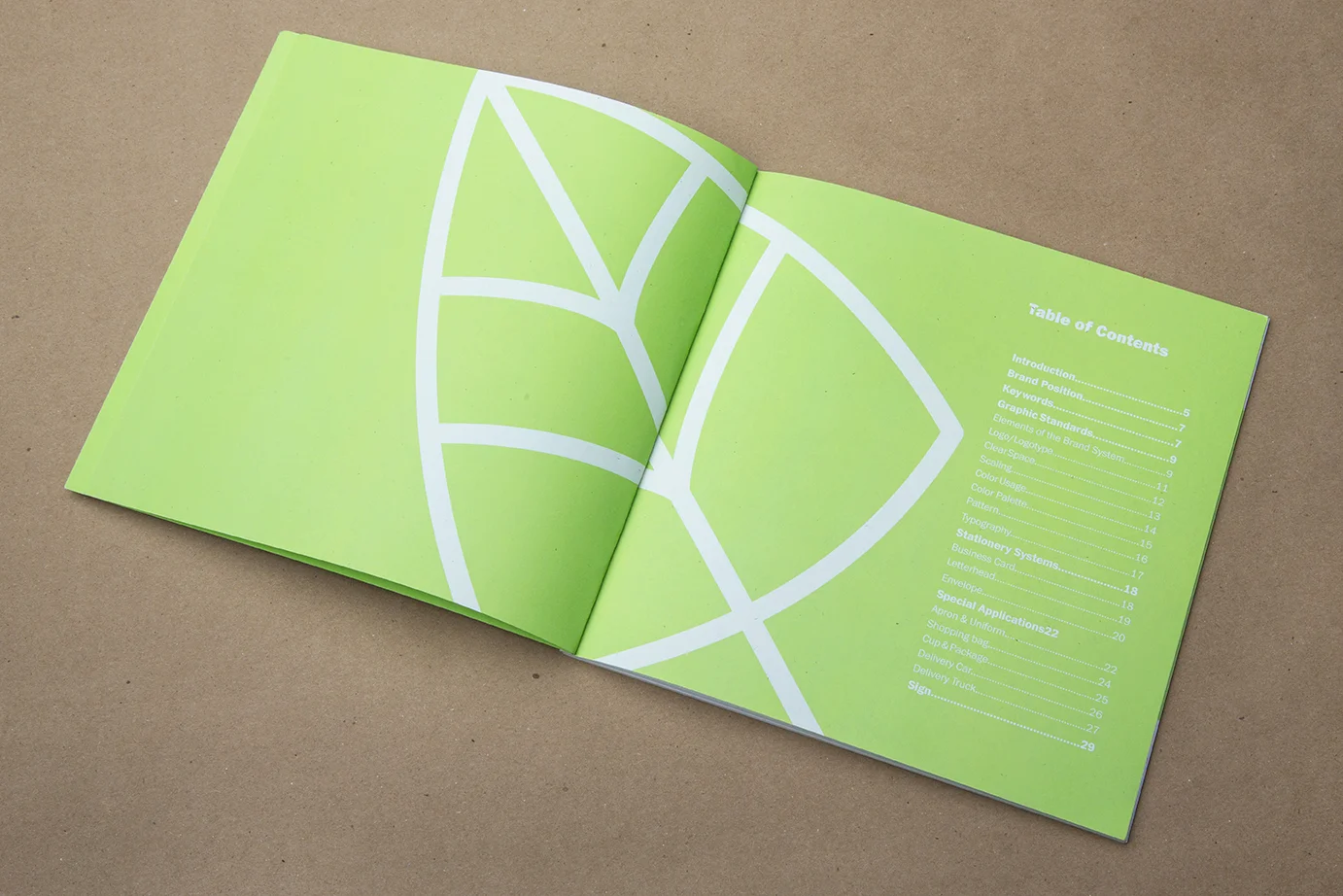
For their rebrand, I chose to utilize earth tone colors: A soft green to represent tea leaves and growth, brown for the branches and soil, and white to represent clarity and enlightenment. The logo is a centralized tea leaf with additional leaves behind it. Together, the leaves form the outline of a lotus flower, which represents purity, divine beauty, expanding of the soul and a spiritual awakening.